Karima El Demerdasch — Mezzo-Soprano Website Design
Karima’s first professional website: a distinctive digital home for an operatic career already reaching Zurich, Salzburg and Wigmore Hall — modern opera editorial, with the confidence of a fashion magazine and the warmth of the theatre.
Visit Karima’s website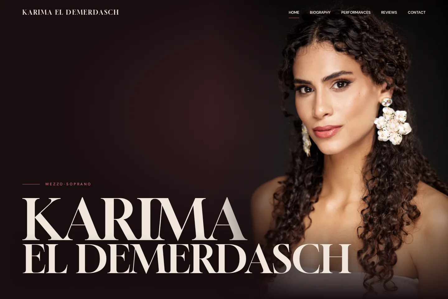
The brief
Starting from a blank canvas
There was no old site to inherit. The work was to create the identity, the structure and the hierarchy from scratch — shaped around performances, press, biography and enquiries.
The identity
An identity with theatrical presence
Oxblood night, ivory and rose. Couture-scale serif headings, a layered oversized name, and Karima’s own photography carrying the mood.
01 · Biography
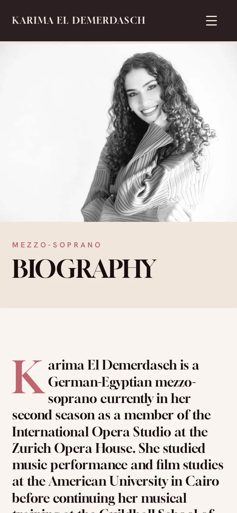
An immersive opening
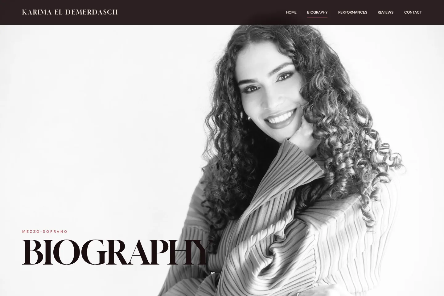
A full-height monochrome portrait gives the Biography its own atmosphere before the story begins.
02 · Performances
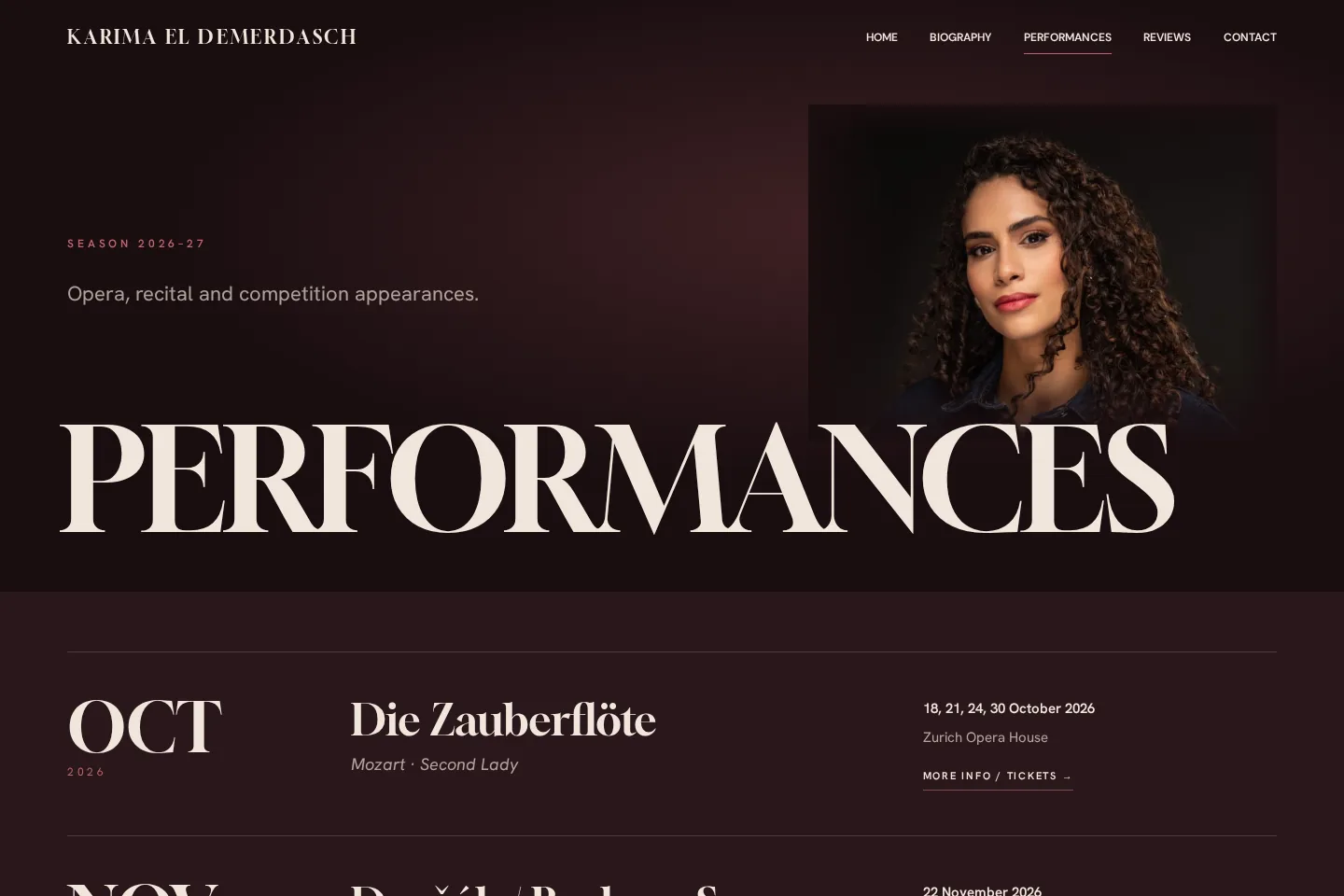
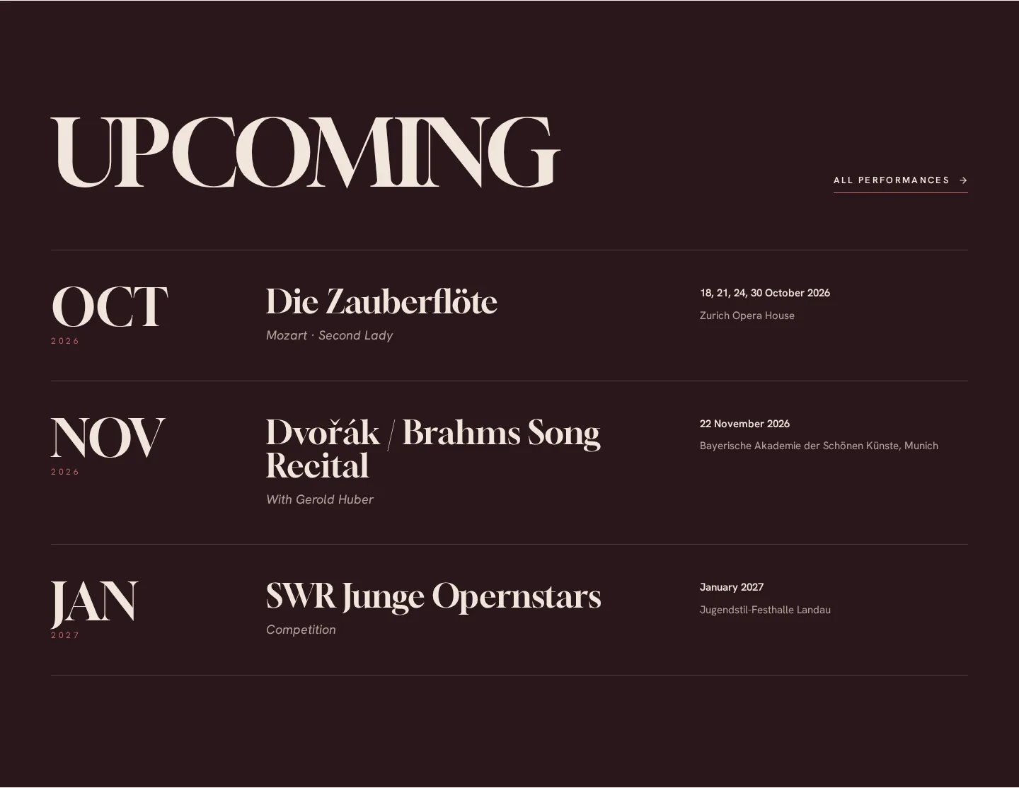
A season, set like a programme
Each engagement reads at a glance: month, work, role, dates and venue, with a direct link to tickets or more information.
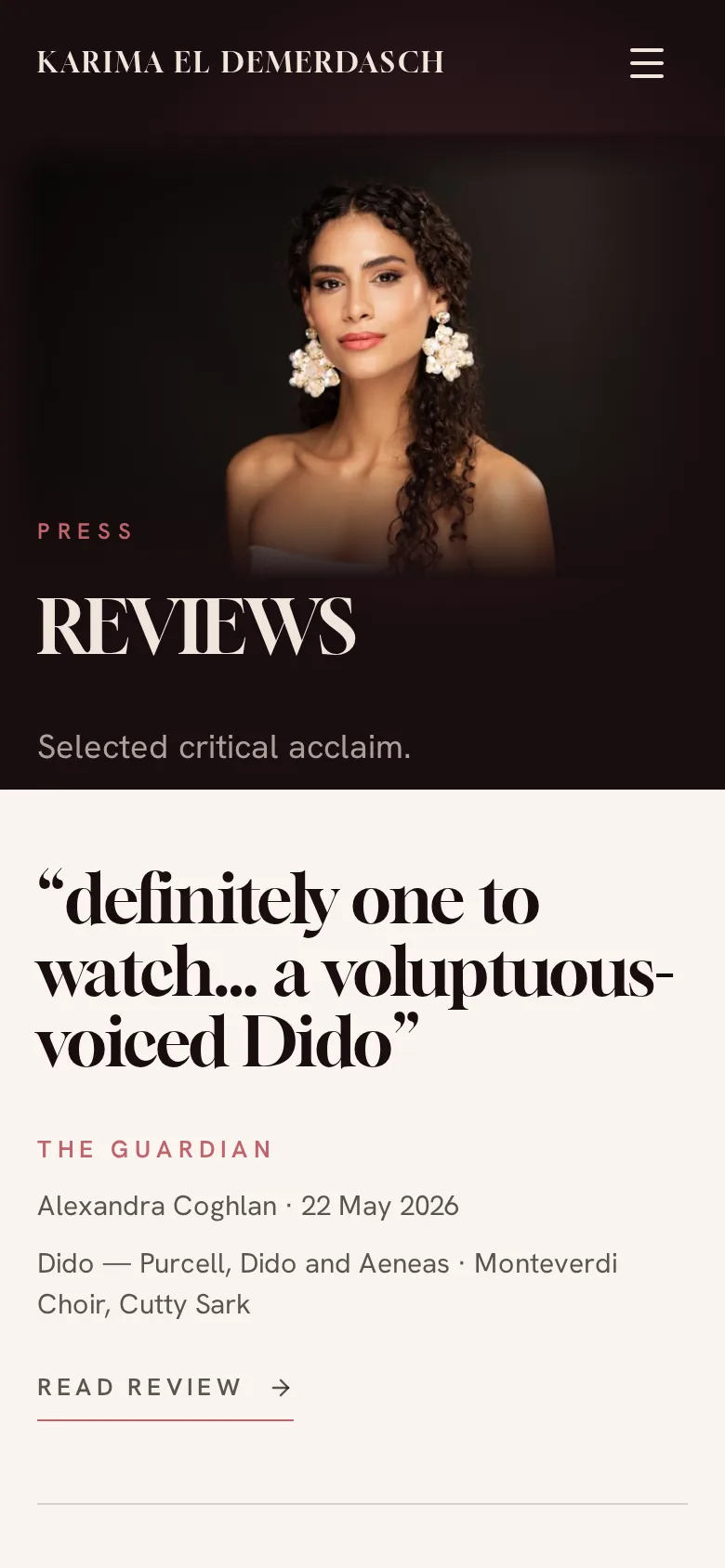
03 · Reviews
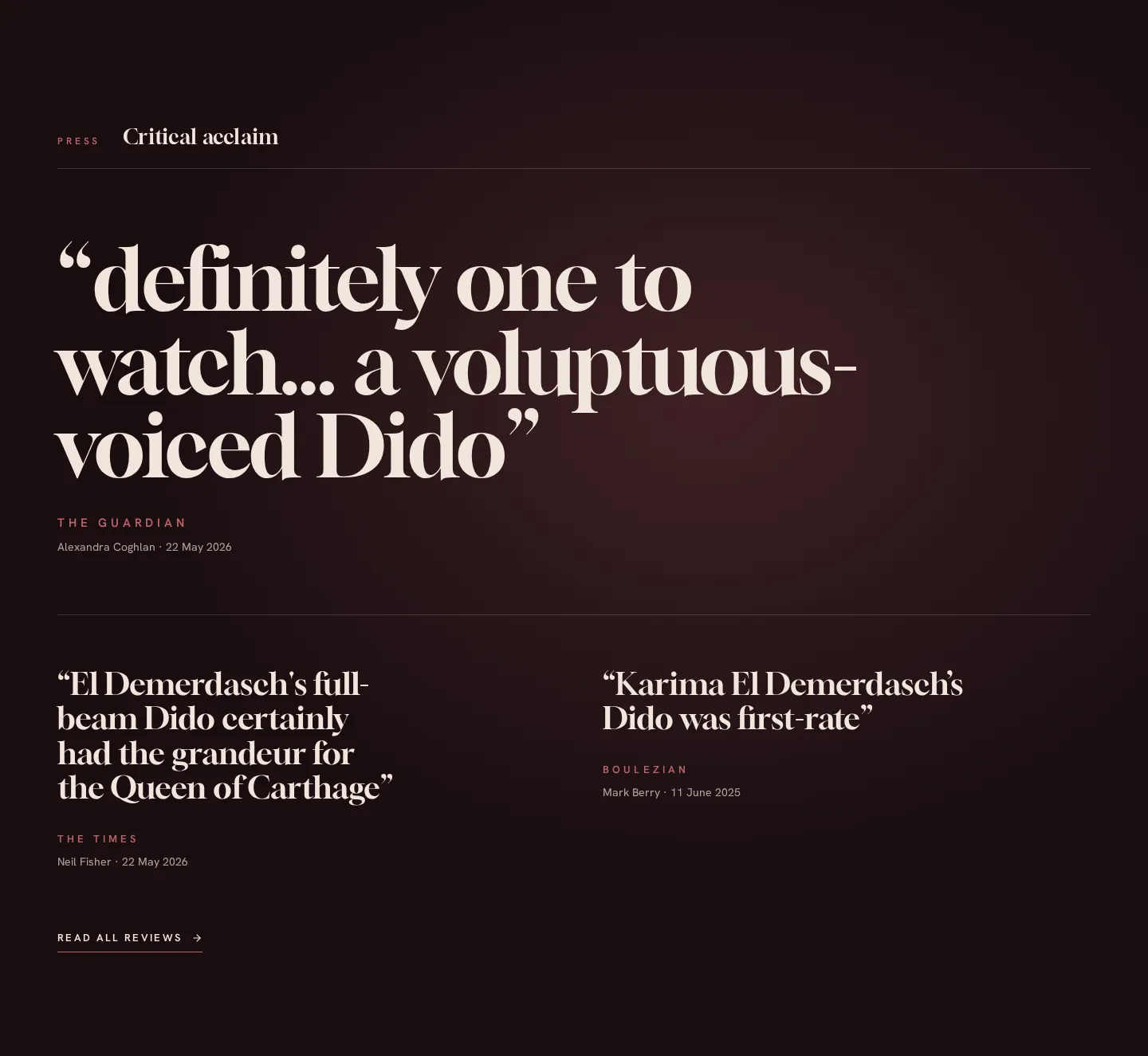
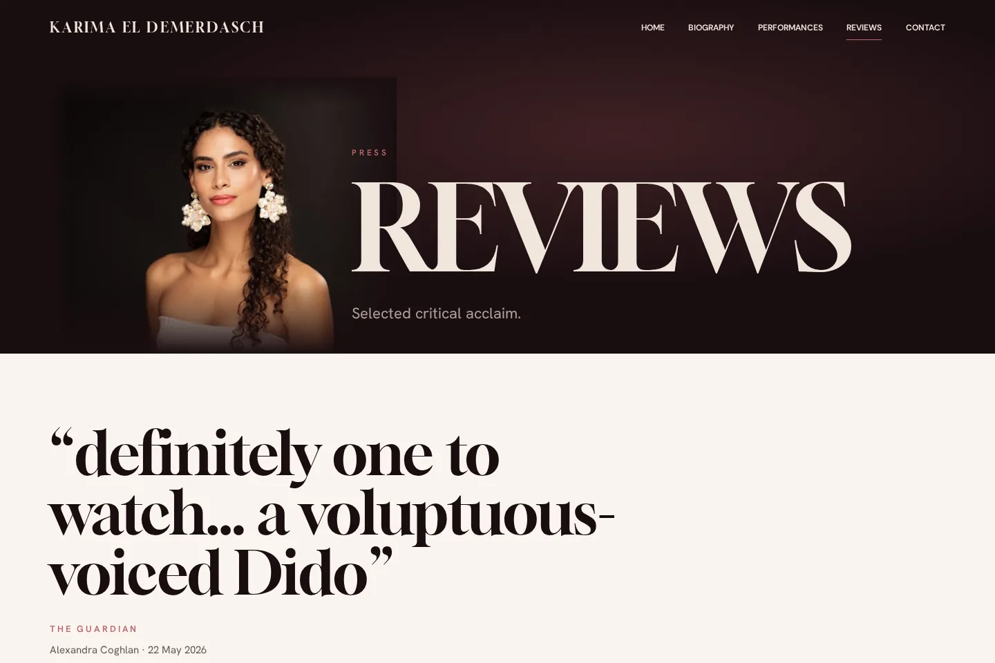
Press with real weight
The Guardian leads the homepage with a large pull quote, supported by The Times and Boulezian. The Reviews page uses the same system: quote, publication, critic, date, production and a link to the full review.
04 · Contact
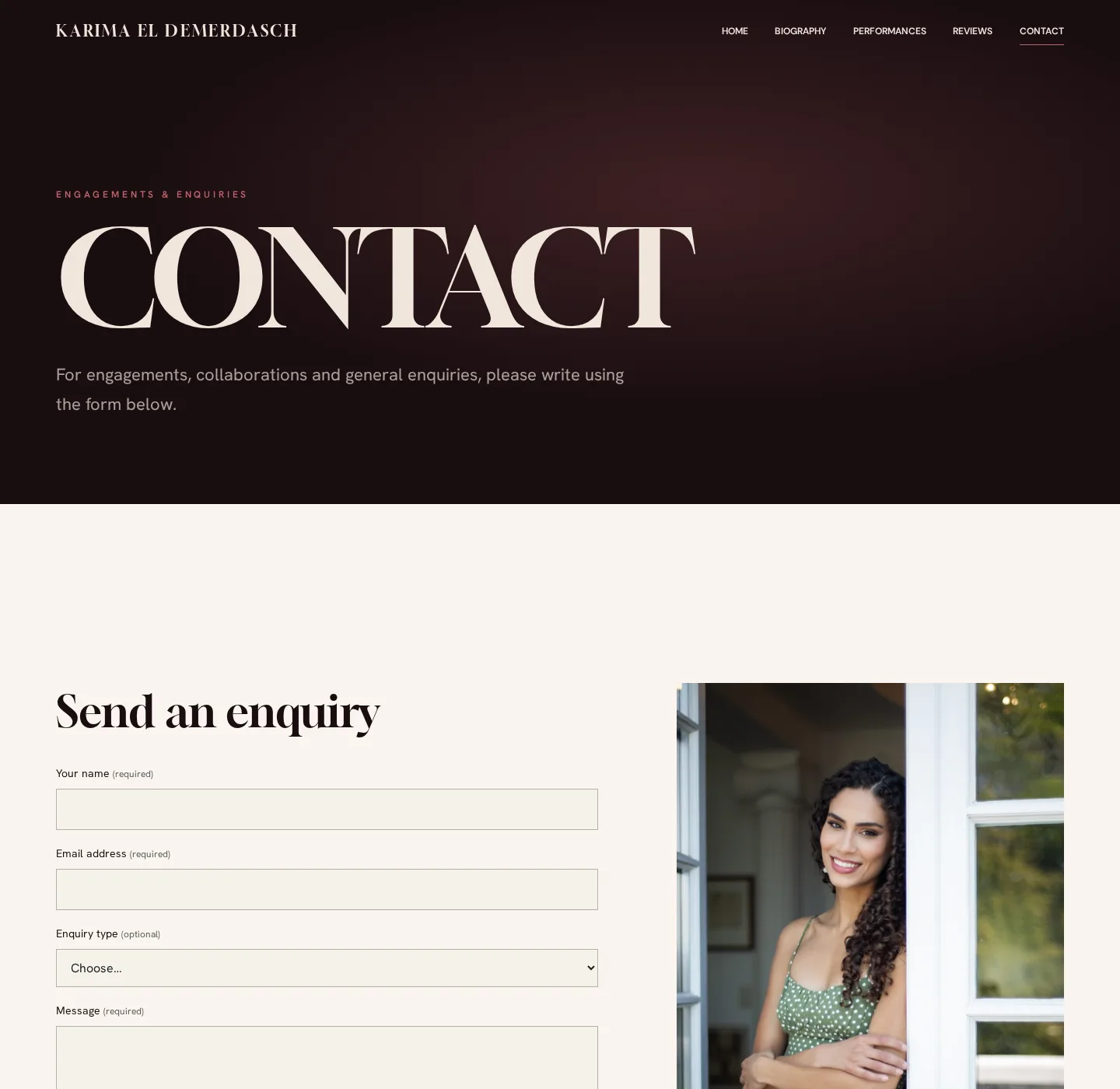
A clear route for engagements
A calm, direct enquiry form for engagements, collaborations and general questions — with no details to hunt for.
05 · Mobile
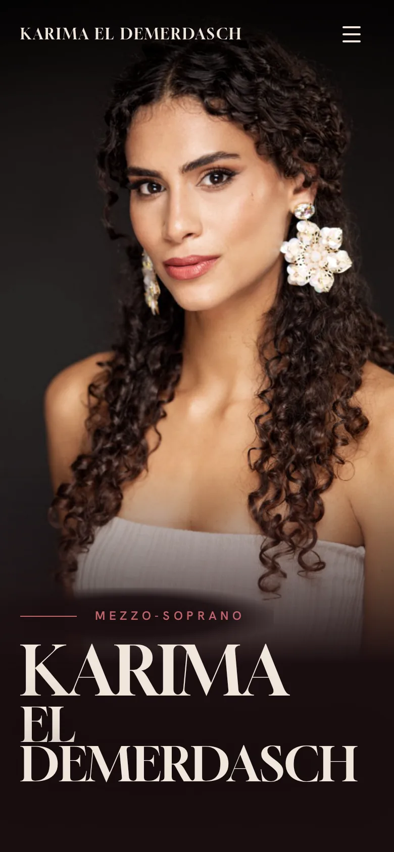
Composed for the phone
Rather than shrinking the desktop layout, each opening was recomposed for a narrow screen, with the portrait and name kept in proportion.
Behind the scenes
Built to evolve with the career
Artist editor
A signed-in editing area behind an artist login, so performances, reviews and page copy can be updated as the season changes.
Performances & press
Dated season entries with ticket links, and one review format shared by the homepage and Reviews page.
Enquiries
A contact form with an optional enquiry type, a spam trap and a linked privacy notice.
Mobile & search
Compositions designed separately for phones, plus page-specific titles and descriptions.
Your first website should feel like you
No template to escape and nothing to inherit — just your career, given its own identity. Every Sonara site begins with a conversation.